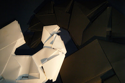
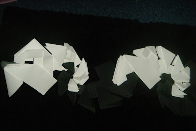
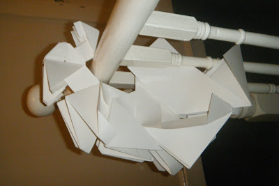
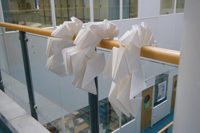
For my poster I have decided to just use black and white and no bright colours. I want the main focus of the poster to be the paper models and for the viewer to focus on the shape of the models and not the colour of them. The text will also be in black and white and will be bold and simple. The text should stand out but it shouldn't be the main focus of the poster. I want the text to work with the model. For example I may make the text follow the curved shape that the chain of models creates.
Poster Research
 Google Images: Last accessed 6th March 2011 at: http://www.disassociated.com/images/posts/graphic_design_winner.jpg
Poster Research

I like this poster design as the main focus of the poster is the colours used and the different directions of lines. All the colours make the poster look very busy, whereas the font is very simple and plain to look at. All the lines are on a diagnol, also the writing is on a diagnol.
 Google Images: Last accessed 6th March 2011 at: http://behance.vo.llnwd.net/profiles/54456/projects/82938/544561207048208.jpg

I like the font in this poster as it uses different thicknesses and some of the letters overlap. Making some words bold puts more emphasis on that word and draws the audiences attention. There is also a lot of space left on the poster as the image is just centred and the text placed beside it.
 Google Images: Last accessec 6th March 2011 at: http://www.liamjaydesigns.com/blog/wp-content/blog_uploads/2010/04/saulbass.jpg

This poster is kept very simple and the main focus on this poster is the text. The text is simple and stands out againts the red background. It is also placed horizontally.

Google Images: Last accessed 6th March 2011 at: http://fc02.deviantart.net/fs71/i/2010/097/3/4/Graphic_Design_Poster_by_cube1987.jpg
Again I like this poster as the text is placed diagnally across the poster which makes it more eye catching and interesting to look at than if it had been placed horizontally.

Google Images: Last accessed 6th March 2011 at: http://farm3.static.flickr.com/2326/2252547555_018206a805.jpg
The text on this poster catches my eye as the words are different sizes and again different thicknesses. I think this looks very effective.

Google Images: Last accessed 6th March 2011 at: http://www.jeetheman.com/files/gimgs/19_poster-1web-2.jpg
This poster caught my eye as I like the way the images interact with the text and cover up parts of the words. The colours also make the poster stand out. Also the simple font works well with the complex drawings.

Google Images: Last accessed 6th March 2011 at: http://www.elbowroomdesign.com/musings/wp-content/uploads/2009/02/james_chance_poster.jpg
The image of a saxophone is used to creat the "J" and the same font has been used however the sizes and colours of the font have been changed. It changes from yellow to orange to red which works really well. The text is the main focus of the poster and is again placed on a slant. Most of the text is on a slight slant however some of the text is on a steeper slant and the rest of the text is arranged next to it.
Reflection
Looking at these poster designs has given me some ideas for my poster layout. Instead of simply putting text in a straight line I would like to try and put words on diagonals. Also it has made me think about the look of the font. Not all the letters have to be the same size or same thickness.